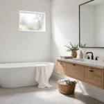
Pastel colors have a reputation for being tricky — go too far and a room can start to feel like a nursery instead of a grown-up living space. Used well, though, pastels are one of the easiest ways to make a room feel calm, bright, and a little more spacious than it actually is.
Quick Answer: To use pastel colors in decor, start small with one dominant pastel shade (on a wall, sofa, or rug), balance it with neutrals like white, beige, or gray, and add depth with metallic accents such as gold or brass. Avoid mixing more than 2–3 pastel tones in one room to keep the space from feeling flat or overly sweet.
Here’s how to bring pastels into your home room by room, without it feeling like an afterthought.
What Exactly Are Pastel Colors?
Pastel colors are simply pale, muted versions of regular colors — created by mixing white into a base color like blue, pink, green, or yellow. The more white added, the softer and lighter the shade becomes. This is why pastels feel calm and airy rather than bold: they have low saturation compared to their full-strength counterparts.
Some of the most popular pastel shades used in home decor include:
- Baby blue — soft, sky-toned blue, popular in bedrooms and nurseries
- Blush pink — a warm, muted pink that works well as an accent wall or upholstery color
- Sage or mint green — an earthy, calming green that pairs beautifully with wood tones
- Lilac — a pale purple with a slightly cool, romantic feel
- Peach — a warm, soft orange-pink that adds coziness without heaviness
- Buttercream yellow — a gentle, non-overpowering way to bring warmth into a space
Step 1: Pick One Dominant Pastel Shade First
Rather than trying to work several pastel colors into a room at once, choose one shade to anchor the space — usually through a wall, a large furniture piece, or a rug. This gives the room a clear identity before you start layering in accents.
If you’re deciding between pastel wall paint and a bolder trim color to frame it, our guide on the difference between wall paint and trim paint is worth reading first — trim color choice can make or break how soft a pastel wall actually reads.
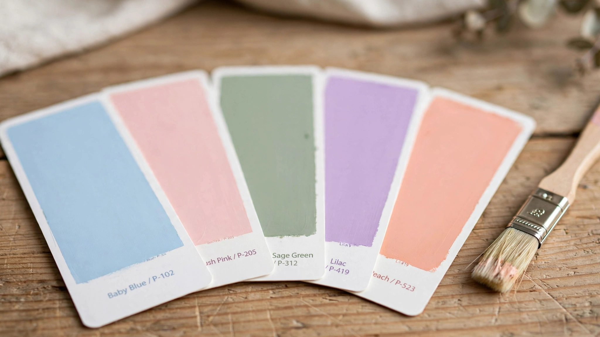
Baby blue, blush pink, sage green, lilac, and peach are among the most popular pastel shades for home decor.
Step 2: Balance Pastels With Neutrals
Pastel colors are at their best when they’re not doing all the work alone. Pairing a pastel wall or sofa with neutral tones — white, cream, beige, taupe, or light gray — keeps the room from feeling overly sweet or one-note.
A simple formula that works in most rooms:
- 60% neutral tones (walls, large furniture, or flooring)
- 30% your dominant pastel shade (an accent wall, sofa, or rug)
- 10% accent colors (cushions, artwork, or a bolder pop of color)
Step 3: Add Metallic Accents for Depth
Because pastels are low in saturation, they can start to look a little flat without something to contrast against. Metallic finishes — gold, brass, or even soft champagne tones — are the easiest fix. A gold-framed mirror, brass drawer pulls, or a metallic side table instantly adds richness next to a pastel sofa or wall.
Step 4: Ease In Through Accessories First
If committing to a pastel wall or piece of furniture feels like too big a leap, start smaller:
- Pastel throw pillows and a throw blanket on a neutral sofa
- A pastel area rug layered over a neutral floor
- Curtains or drapes in a soft pastel tone
- Ceramics, vases, or planters in mint, blush, or lilac
This lets you test how a shade feels in your space’s actual lighting before committing to something larger, like reupholstering furniture. If you’re considering refreshing a leather piece with a softer tone, our guide on how to dye leather furniture walks through the process for anyone wanting to bring a muted pastel into an existing piece rather than replacing it.

Pastel throw pillows and a throw blanket are an easy, low-commitment way to bring pastel tones into a room.
Step 5: Consider the Room’s Natural Light
Pastels react strongly to lighting, since pale colors reflect more light than darker ones:
- Bright, sunlit rooms can handle slightly deeper pastel tones without looking washed out.
- Dimmer rooms or spaces with limited natural light look better with the lightest, airiest pastel shades, paired with warm lighting to avoid feeling cold or flat.
- Warm-toned lighting (soft white or warm white bulbs) tends to make pastels feel cozier, while cool white lighting can make them feel more clinical.
Room-by-Room Pastel Ideas
- Bedroom — baby blue or lilac walls with white bedding and brass accents create a calm, restful feel.
- Living room — a sage green or blush sofa against neutral walls, with a gold coffee table and patterned pastel cushions.
- Kitchen — pastel cabinetry (mint or buttercream) paired with white countertops and black or brass hardware for contrast.
- Bathroom — a single pastel accent wall (peach or powder blue) with white fixtures and natural wood or rattan accents.
- Nursery or kids’ room — layering two or three soft pastels together works well here, since the space calls for a gentler, playful palette.
Common Mistakes to Avoid
- Using too many pastel shades at once, which can make a room feel busy instead of calm — stick to one dominant tone plus 1–2 accents.
- Skipping contrast entirely — an all-pastel room with no neutral or metallic balance can start to feel flat or overly saccharine.
- Choosing a pastel shade under artificial store lighting without testing it in your room’s actual daylight and evening lighting.
- Pairing cool and warm pastels carelessly — for example, an icy lilac next to a warm peach can clash rather than complement.
Frequently Asked Questions
Do pastel colors make a room look bigger?
Yes, pastel colors reflect more light than darker, saturated colors, which can make a room feel more open and airy — especially useful in smaller spaces.
What colors pair well with pastels?
Neutrals like white, cream, beige, and gray pair well with almost any pastel shade. Metallic accents like gold and brass also add contrast and prevent the palette from feeling flat.
Can I mix multiple pastel colors in one room?
Yes, but it’s best to limit it to 2–3 pastel shades that share an undertone (all warm or all cool) to avoid the room feeling mismatched. Pick one dominant shade and treat the others as accents.
Are pastel colors only suitable for nurseries or kids’ rooms?
No. When balanced with neutrals and metallic accents, pastel colors work well in living rooms, bedrooms, kitchens, and bathrooms for a soft, sophisticated look rather than a childish one.
Ready to bring pastel tones into your space? Explore more color and styling guides on Ayaan Home Decor for tips on paint, furniture, and interior finishing touches.
Last modified: July 27, 2026